How to Design an Event App to Achieve Sponsorship Goals
The design of an event app is a powerful tool that is often underutilized. Through design, you can not only leverage your event brand, but you can also increase your event app adoption, attendee engagement, and overall ROI through sponsorship.
When you consider sponsorship as a major influential factor in your event app design, it forces you to be more purposeful in building your event app. You have to design it in a way that helps you achieve measurable goals and objectives that go beyond attendee engagement.
How to Design an Event App to Reach Sponsorship Goals
Designing your event app in a way that maximizes sponsorship exposure goes beyond just listing your sponsors in the app. Take it a step further and consider what ROI looks like for your sponsors.
Identify your sponsors’ event goals
Sponsors attend your event for many reasons, but most of the time it all boils down to getting new business, meeting existing business, and/or getting increased brand exposure to your audience. When used effectively, event app design can help your sponsors accomplish their goals and keep them coming back year after year. The easiest event app features that can be leveraged are the event app home screen and event games.
Event App Home Screen
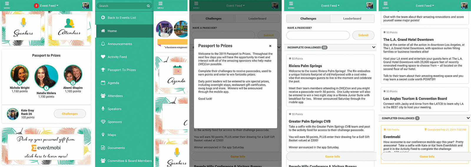
Create custom home screen widgets for your sponsors to increase brand exposure. Also, depending on the call-to-action, you can help drive traffic to their staff on-site at the event. The more interactions sponsors have with attendees, the more success they will have in acquiring new and existing business contacts.
You can include home screen widgets as part of your sponsorship packages or as an add-on. Within the widget, you can promote their booth #, any kind of on-site activation like a promotion or giveaways, or any sessions they might be speaking at. You can design these widgets in a way that explicitly looks like an advertisement, or make them appear more ‘native’ and incorporated into your overall home screen design.
Event Gamification
Design your event games around some of your sponsors and their goals. Do they want foot traffic to their booth? Do they want to network with attendees? Do they want to give away prizes for more brand exposure? A well-designed game for your event and event app can totally transform your event for sponsors and attendees. You will naturally see an uptick in event app adoption and engagement which will give the rest of your app more leverage with your audience. Read our ebook, 5 Surefire Gamification Strategies to Crush Your Event Goals, to learn specific event games that help you achieve your desired event goals.
Recommended Read: How to create a sponsorship strategy that will maximize your event revenue
Another Thing to Consider When Designing
When considering your event app design, your attendee and user experience is one of the most influential factors in executing a successful design. If your design is effective at guiding attendees through your app and event, you will also be satisfying your sponsor goals. They go hand-in-hand!
Attendee/User Experience
Consider how much effort your design is requiring from users. The fewer clicks the better – don’t make your attendees dig for information!
Also, consider what’s on the menu. Whatever goes on your home screen should go on your main menu. Your home screen should emphasize your event brand and theme, sponsor activations, and your ‘hot buttons’ – i.e, the main sections of the app that you think are the most important to highlight.
The main menu is your full list of event app sections. It’s everything and anything your attendees will need access to for successfully navigating your event. With that being said, don’t treat your home screen design like your main menu. Keep it simple, clean, and uncluttered.
There are many ways to organize the main menu, but my suggestion is to put the most important engagement pieces at the top for super quick and easy access (announcements, gamification, and live polling are typically my top 3) After that, I will usually order up the agenda, speakers profiles, attendee profile, and sponsor profiles.
After that, I list all other sections by similar types of information or order by rank of importance. Keep in mind, people skim from the top to the bottom, so put the sections they are going to frequent the most, or where you want to generate the most traffic, at the top!
Recommended Resource: We’ve put together a selection of amazing event app designs to inspire you. Check out the best event app designs we’ve created for our clients!
