Conference Day At-A-Glance: A Better Way to View Agendas on Mobile Event Apps [New Feature]
Helping attendees access conference information with ease is one of the most important goals for any event planner. As more events adopt mobile event apps over printed guides, visualizing and organizing the agenda for attendees on a small screen can be a challenge. This is especially true when a conference has anywhere between 30 and 300 sessions per day, not to mention multiple tracks. Attendees have to manage time conflicts and explore sessions that are most valuable to them in concurrent session blocks. Endless scrolling and the fear of missing out on relevant sessions can leave some attendees discouraged and overwhelmed when they are planning their day on their smartphones.
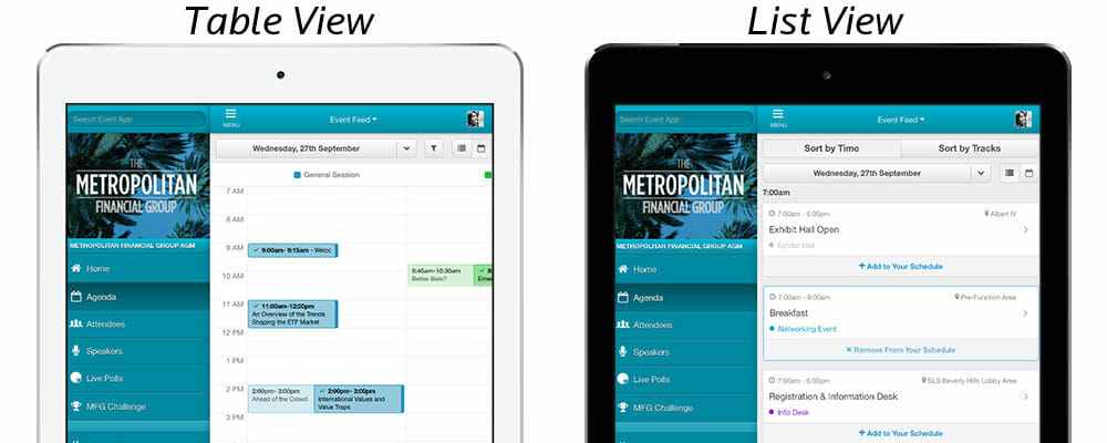
To help marketing professionals and event planners create that ultimate event experience for their attendees, we are excited to announce that all existing and new EventMobi event apps now have an option to view daily agenda in the standard list view or in the new Table View. The Table View mode allows your attendees to view each day’s agenda in a time and track based table or matrix, instead of the traditional list view.

Attendees can choose either Table or List View.
What makes the new Table View unique is that attendees can visualize their daily agenda by either track or location and each column is color-coded, making it easier for attendees to view concurrent sessions and manage session conflicts. Once the attendee has added a session to their schedule, it will display in a richer version of the track color and a check mark appears in the top left corner. Sessions that delegates can attend but haven’t yet added to their personal schedule can still be viewed, but are dimmed. Attendees can scroll vertically through time to view all the sessions in one track or location, and horizontally to navigate through different tracks within a particular time block. Event apps help attendees visualize what’s available for that day at-a-glance and easily manage session conflicts and create their perfect daily plan at your conference.
The Perfect Day Planner
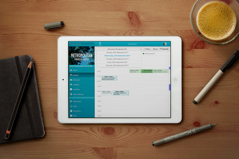
The customizability of EventMobi’s Agenda Module with the new Table View option also includes a new header that has a date drop-down menu, a filter button, and a toggle button to switch between an Agenda List View and the Table View. Based on the filter chosen, attendees can view the agenda by tracks or locations. The location filter can be particularly helpful for attendees if your event is held in a venue (or venues) where distances between rooms can be a bit of a hike for attendees and sessions in one track are located in the same area. Attendees might want to attend nearby sessions and EventMobi’s Table View can help achieve exactly that.

Attendees can view their agenda in the same way they view their calendar.
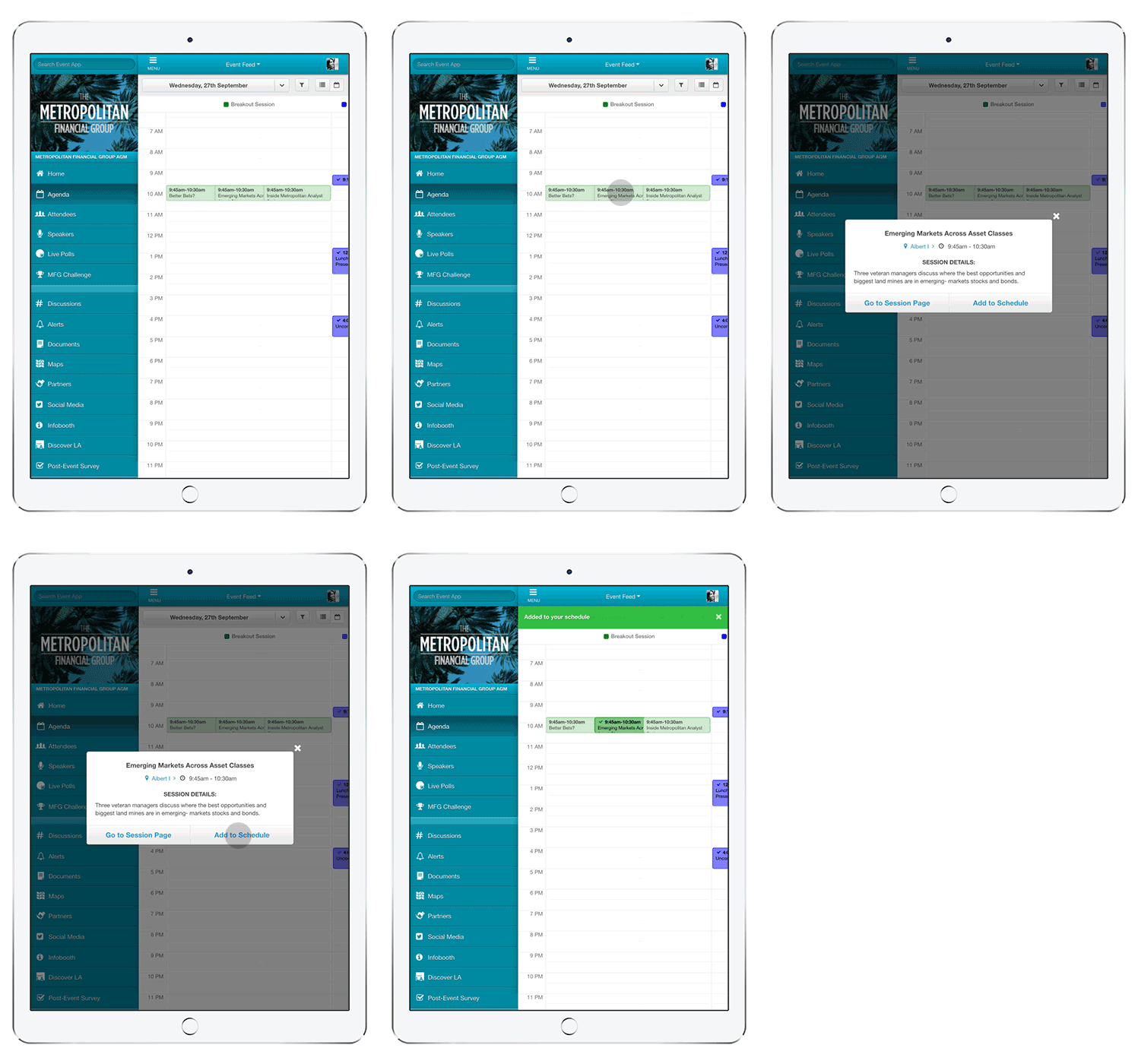
When viewing the Agenda in Table View, a user can tap on any session and a modal will appear displaying the title, location, time, and session details. This session modal also links to the session details page and attendees can add the session to their personal schedule if they haven’t done so yet.

Scheduling conflicts are easily managed.
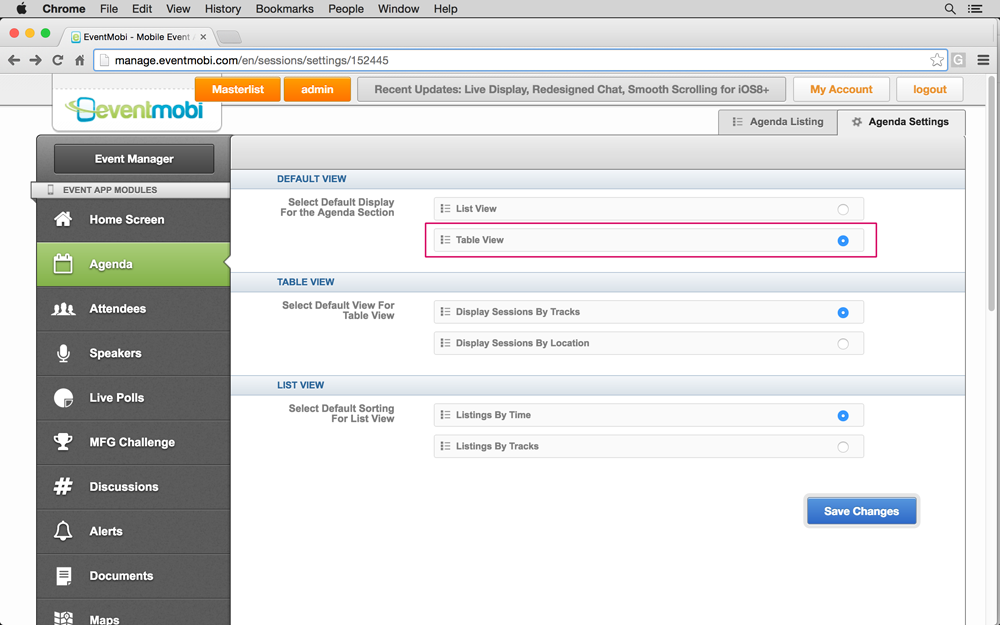
Planners can enable or disable Table View from the Agenda Settings within the Agenda module in the CMS and default the agenda to this view. If you enable Table View, it will be displayed in attendees’ personal profiles alongside the agenda list view.

Once enabled by Support, you can add Table View on the EventMobi CMS in just a few clicks.
Table View is a great way to get attendees to start using your mobile event app before your event. Once your agenda is complete, attendees can view your agenda on their desktop browser and start planning their schedule. Attendees can easily view all sessions and tracks on their desktop and decide which sessions they’re excited about, which concurrent sessions they’re going to attend, filter the tracks that are most relevant to them and create a complete schedule all before attending your event.
When attendees attempt to build out their personal schedule, it’s easy for them to quickly see times for concurrent sessions, overlaps between sessions and how their personal schedule maps with other available event sessions using the new Table View. The ability to quickly filter tracks or locations that are most relevant to the user at the time makes it an intuitive tool to navigate through tracks and time of sessions especially for events with a large number of sessions or breakouts each day.
Help make it easy for your attendees to manage their schedule and not miss a single session. Interested in using Table View in your app? Contact your account manager or support specialist to enable Table View for your mobile event app today.