The Best Association Websites: 10+ Stunning Examples
Your website is your organization’s virtual home base. It’s the space where current members access their benefits, new visitors scope you out, and your team highlights upcoming events in detail.
Curious about what makes an association website shine? We’ll show you over 10 examples of the best association websites and take a look at high-quality association event websites!
But first, let’s go over a few basics of why association websites matter and what factors make a website strong.
Association Website Benefits
Building an association website with valuable content and an attractive web design can help your organization:
- Retain current members. Your website serves as your association’s hub for all of your offerings. Members should be able to log into your website to access resources, connect with other members, and participate in your community.
- Attract new members. For today’s professionals, the internet is one of the first places they’ll turn to find information on their career fields, including top associations to join. Even for those who get a word-of-mouth recommendation, a website provides all the information prospective members need to decide to join.
- Raise the value of your sponsor packages. Sponsors want to get their brand name and offerings in front of your members. With an active website, they can! Add their logo to a dedicated sponsors page or feature ads from them on your member community platform.
- Boost event registrations. Prospective members looking to make connections in their industry might stumble upon your next event by accessing your website. Create a one-stop location for everything about your upcoming events, including how to register.
- Drive non-dues revenue. Revenue from sponsorships, product and service sales, and event registrations are essential for growing your association. A website ensures prospective sponsors can find your association, members can browse your product offerings at their leisure, and people can buy event tickets at any time.
- Gather key data about member behavior. Connect your membership website to your association management or member engagement software to track member data and discover trends in their behavior. For example, you might find that members tend to upgrade their membership tier after engaging with your online community or that a specific industry blog often drives traffic to yours.
7 Must-Have Features of Association Websites
A great website is simple, enjoyable to explore, and naturally guides users to the content they’re looking for. Not sure where to start when designing your website? Here are seven vital building blocks of your association website:
- Intuitive user experience. A user-friendly website design creates a positive experience that boosts member conversion and engagement. Ensure your site has clear navigation menus, recognizable icons, and stand-out buttons. Get feedback on your design by having someone unfamiliar with your association visit your site, and ask them to complete a specific task, narrating their thoughts aloud. This exercise will provide insight into visitors’ assumptions about your site navigation and whether it is intuitive.
- Clear and consistent branding. Build brand recognition by using consistent design elements, like colors and fonts that tie back to your logo. This ensures visitors will have no question about what organization they’re interacting with.
- Highly visible CTAs. A great association website should feel like it comes with its own tour guide! Encourage people to “become a member today,” “explore our offerings,” or “learn more” with CTAs that catch the eye. When creating these CTAs, use colors that stand out from the background, a bold font, and interactive elements, such as changing size or color when the CTA is hovered over, to make them easy to read and click on.
- Relevant content. Your members want content relevant to your association’s stated mission. Ensure your offerings, blog, and other pages all relate to your association’s primary purpose to keep member engagement high.
- Mobile responsiveness. In one survey, 52% of users said they were less likely to engage with a company after a bad mobile experience. Considering the fact that over 63% of website traffic comes from mobile devices, mobile responsiveness is essential to web design.
- Event tech integration. Event tech gives you a leg up when designing your website by allowing you to foster community networking with an event app, organize one-time and year-round events, and more!
- SEO optimization. Getting to the top of Google’s results page can introduce your association to a whole new audience. Plus, ranking highly on Google can make your organization seem professional, dynamic, and trustworthy. If you’re just starting your SEO journey, tools like SEMRush can help you identify essential keywords prospective members are likely to search for.
10 Association Website Elements to Boost Engagement
Ready for the next step? Once you’ve nailed the basics with the features above, use an association website builder to include these 10 elements that add value and encourage visitor engagement:
- Event calendar. Include the date, time, location, relevant links, and a short description of each event. Allow users to scroll through your calendar to find upcoming events and register for them.
- Event pages. Creating unique pages for each event builds member interest, provides context, and drives registrations. Your event page could feature a registration form, FAQ, event speaker information, programming schedule, code of conduct, travel details, and more.
- Member directory. Allow members to connect through a searchable member directory. On your community platform, allow members to create profiles, browse your directory, and send direct messages. Make sure members have privacy controls so they can decide who can see what information. For instance, members might decide their name and job title can be visible to the public but only registered members can see their email addresses.
- Members-only spaces. Exclusive spaces enable your members to build a thriving online community, which is one of the top association member engagement strategies! Consider investing in a community platform that allows members to post questions, observations, and content. This ensures they can connect at any time, keeping engagement high.
- Member benefits page. By providing information about pricing, perks, and renewal periods, a member benefits page makes it simple and appealing for prospective members to join your association. Embed a registration form into your benefits page or add a CTA so interested visitors can join right away.
- Resource pages. Access to private resources is a great perk for members, but that doesn’t mean your association website shouldn’t include public resources, too! A public resource page is the perfect place for non-members to preview what your association has to offer. Use your website builder to strategically set some of your content to members-only and other resources visible to the public.
- Videos and images. Not only are visuals a handy way to break up the monotony of too much text, but they also give your visitors another way to consume information and engage with your site. That said, we suggest avoiding autoplay, as many visitors find it jarring, and it’s an accessibility concern.
- Contact information. Make it easy for visitors to connect with your team by creating a Contact page and adding your contact details to your website’s footer. This should include an email for queries, a phone number, your address, and hours of operation.
- Sponsor placements. Featuring sponsor logos or banners can help market your association and build partnerships that bring in extra revenue. When prospective sponsors see what other organizations you’ve worked with in the past, you build credibility and set yourself up for successful partnership agreements.
- Analytics and tracking software. Want to ensure your website is making the right impression and providing value to your audience? Tools like Google Analytics and member engagement platforms provide key insights into visitor behavior and patterns. This data can help you continually improve your association website to always meet member expectations.
Recommended Resource: 📺 Are you looking for cost-effective, easier ways to build and manage your events? Watch 8 short videos to learn how to deliver events in any format that engage attendees and offer sponsors more value—no matter your team size or budget!
7 of the Best Professional Association Website Examples
Professional associations serve individual people, and provide:
- Industry resources
- Networking opportunities
- Tools for professional development
Here are 7 great examples of professional association websites!
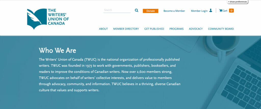
1. The Writer’s Union of Canada
The Writers’ Union of Canada (TWUC) is the national organization of professionally published writers. TWUC was founded in 1973 to work with governments, publishers, booksellers, and readers to improve the conditions of Canadian writers, and now serves over 2,600 members.

What we like:
- Highlights membership and impact on the landing page
- Consistent branding in their association web design
- Top buttons for donors, current members, and prospective members
Top takeaway: TWUC’s website delivers information about what the association offers, who it serves, and how to get involved with clean and consistent visual design.
2. International Live Events Association
The International Live Events Association (ILEA) is a global community of thousands of creative event professionals whose skills, expertise, and experience power some of the most influential live events around the world.
What we like:
- Center bubble links to the membership page
- Separate bubbles for each member segment
- Member pains are identified with “resilience and recovery resources for live event professionals” placed at the top of the page
Top takeaway: The ILEA’s membership website design highlights the help they offer across the industry and guides visitors straight towards the membership page!
3. The Wildlife Society
Founded in 1937, The Wildlife Society is an international network of over 11,000 leaders in wildlife science, management, and conservation who are dedicated to excellence in wildlife stewardship.
What we like:
- Target demographic (“wildlife professionals and students”) is top of page
- Relevant and eye-catching photographs included in branding
- Visible conference spotlight
Top takeaway: The Wildlife Society’s association website design inspires the feeling of reading wildlife magazines, and invites people of all experience levels to learn more about nature.
4. Out in Tech
Out in Tech was made to unite the LGBTQ+ tech community by creating opportunities for members to advance their careers, grow their networks, and leverage tech for social change.
What we like:
- Impact is highlighted and celebrated on page one
- Their mission statement has a CTA: “become a sponsor”
- The website design is elegant to look at and navigate
Top takeaway: Out in Tech’s association website design is a masterclass in using the CTA! As you read about their work, there are always invitations to get involved as a member, volunteer, donor, or sponsor.
5. Society of Black Archaeologists
The Society of Black Archaeologists advocates to ensure proper treatment of African and African Diaspora material culture, promote more people of African descent to enter the field, ensure community collaborations, raise and address concerns related to African peoples worldwide, and highlight the archaeological achievements and contributions of people of African descent.
What we like:
- Consistent branding—website colors tie back to the logo
- Individual members are spotlighted throughout the website
- Member page has a link to member directory
Top takeaway: The Society of Black Archaeologists’ association website reflects its mission to support its members by highlighting them in both spotlights and a news section.
6. American Baseball Coaches Association
The American Baseball Coaches Association (ABCA), founded in 1945, is the primary professional organization for baseball coaches at the amateur level.
What we like:
- Thorough accessibility functions
- Many pictures of its members
- Resources are consistently highlighted—including a mobile app!
Top takeaway: The ABCA site has a lot of great elements, but its integrated accessibility software is a fantastic example of what accessible association website design can be.
7. American Society of Baking
The American Society of Baking is a community of baking industry professionals who have joined together to provide continuing education, networking opportunities, and professional development.
What we like:
- Tidy drop down menus
- Membership benefits page includes text, graphic, and video elements
- All visuals call back to the art of baking
Top takeaway: The American Society of Baking has been around for 100 years, and its association website compiles its past accomplishments and future goals in a way that is modern and inviting to prospective members.
4 Best Trade Association Websites
Whereas professional associations are for individuals, a trade association’s membership base is typically comprised of businesses.
Here are 4 great trade association website examples:
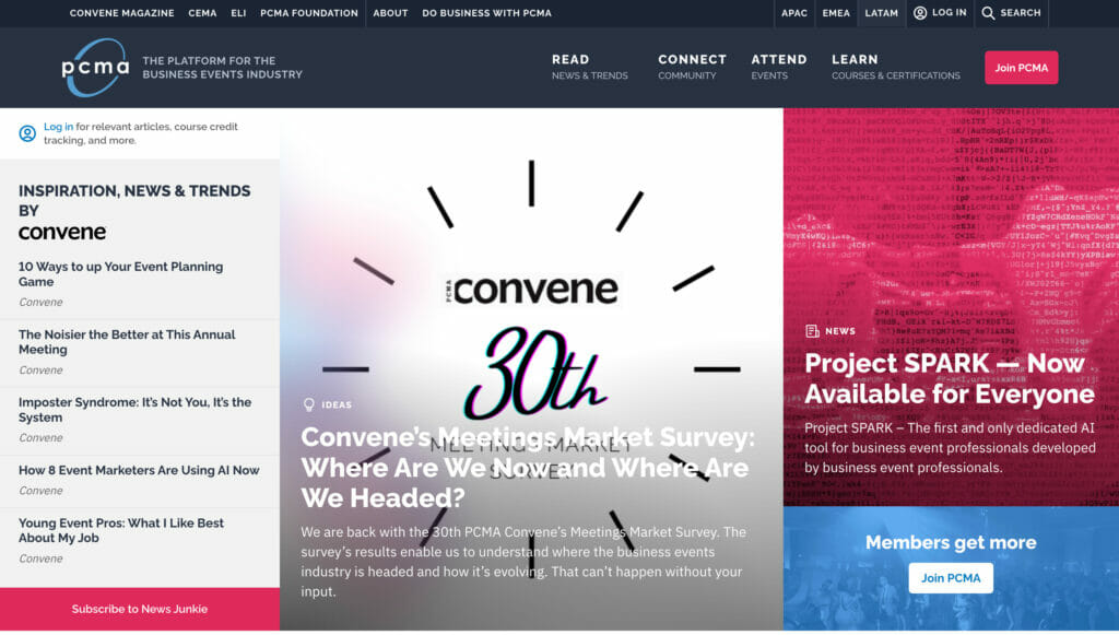
1. PCMA
PCMA is the world’s largest community for Business Events Strategists, providing senior-level education, networking, and market intelligence for the global business events industry.

What we like:
- Information is organized into a “Hot Topics” section
- PCMA’s magazine, Convene, is spotlighted in multiple places
- Multiple newsletter sign up options
Top takeaway: PCMA successfully organizes a great deal of content so members and visitors can pick and choose what’s most relevant to their needs.
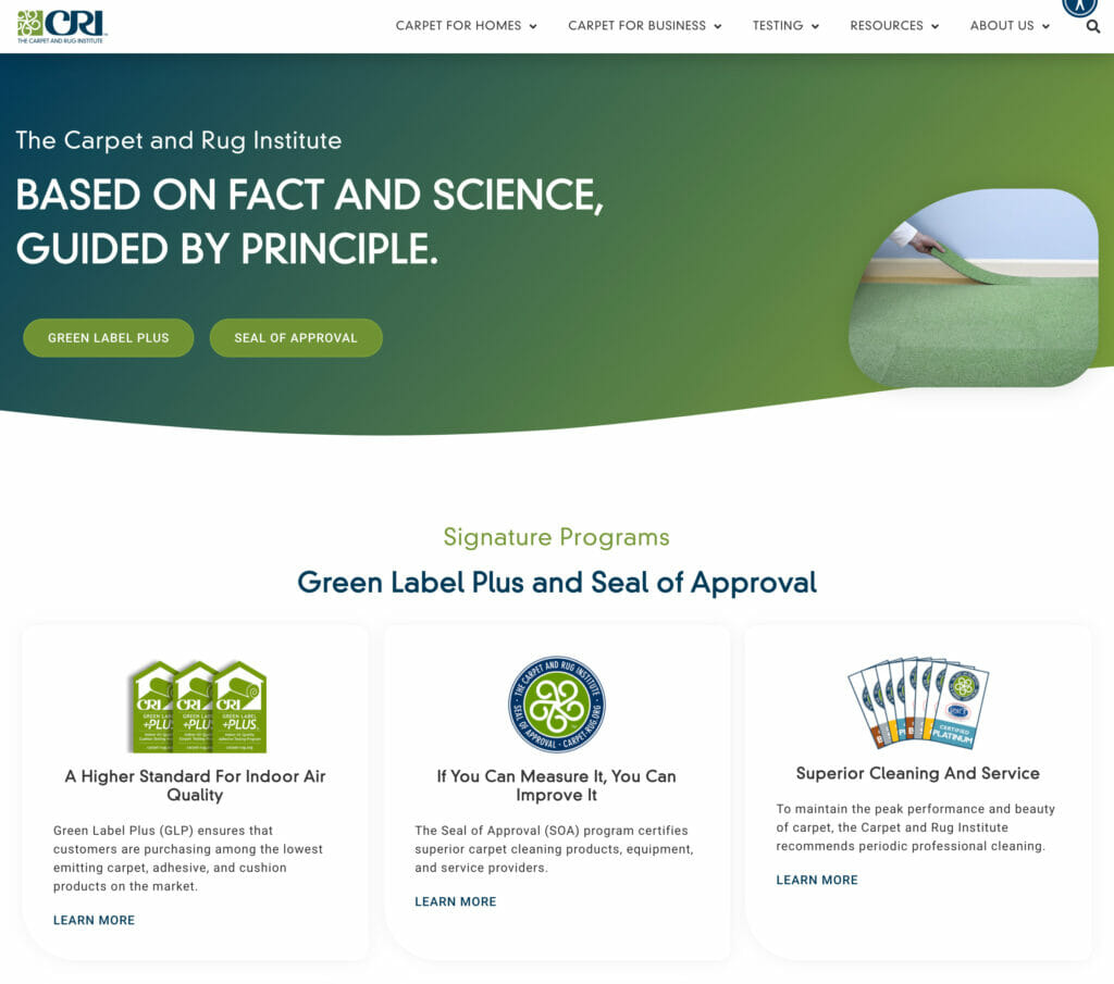
2. The Carpet & Rug Institute
The Carpet & Rug Institute’s purpose is to educate consumers, commercial stakeholders, and the industry about health benefits, environmental efforts, and trends related to carpets and rugs.

What we like:
- Programs are clearly laid out and explained
- Consistent colors aligned with the logo
- Member directory open to the public
Top takeaway: While many professional association websites keep their directory password-locked for the sake of members’ privacy, it benefits trade associations to show off their members! The CRI’s directory does just that, listing the membership category as well so people can find collaborators.
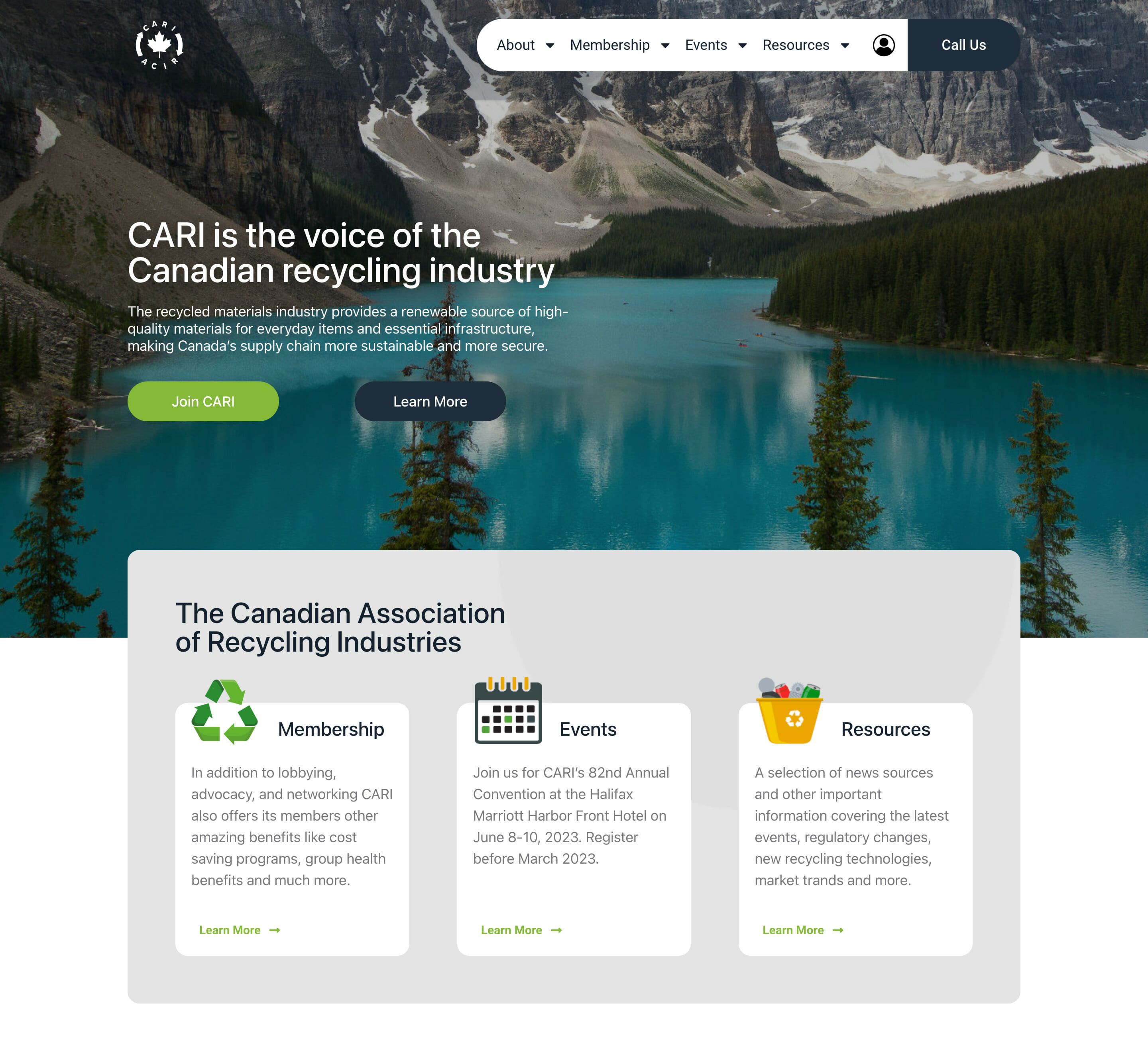
3. Canadian Association of Recycling Industries
The Canadian Association of Recycling Industries (CARI) represents well over 200 member companies in the recycling sector. Their members process, broker, and consume commodities, including ferrous and non-ferrous metals, electronics, paper, rubber, glass, textiles, and plastics.

What we like:
- Thorough (and attractive!) accessibility tools
- Clear links to membership page, event info, and resources
- Membership sign up page has intuitive design
Top takeaway: CARI’s easy-to-use website gives readers all the information they could need about membership and the recycling industry without overwhelming the eye.
4. Cosmetics Alliance Canada
Cosmetics Alliance Canada is the leading Canadian trade association representing more than 150 member companies who manufacture, distribute, and supply personal care products marketed in Canada.

What we like:
- Public job board
- Clear breakdown of programs in the drop-down menu
- “Exploratory membership” option for startups with no significant sales
Top takeaway: Cosmetic Alliance Canada’s association website has resources available for people at varying stages of their career journey. It cheers for the industry above all, and creates incentives to become a member and help shape the future of cosmetics in Canada.
Do You Need an Association Event Website?
It’s perfectly possible to simply set up an event page on something like Eventbrite, but we highly recommend building your own association event website! This strategy ties your association’s brand to the event and directs valuable traffic back to your home page.
Your event website can include:
- Travel details for in person events
- Your code of conduct
- Speaker bios
- Detailed schedules
- Links to your event app
- Video components
- And more!
Now that we’ve covered membership page examples, here are two association event website examples from organizations we highlighted above:
1. PCMA: EduCon 2023
PCMA’s EduCon is an annual convention dedicated to fostering industry collaboration, tapping into the insights of innovation trailblazers, demoing prototypes of progressive learning formats, and developing a modern event playbook packed with career opportunities.
What we like:
- Links to the EduCon 2023 event platform
- Schedule is separated by each stream of programming
- Detailed page about hotel and travel
- Video components
Top takeaway: PCMA’s association event website highlights the organization’s values through creative conference programming, and inspires people to sign up for pre-conference programming, too!
2. The Wildlife Society’s 30th Annual Conference
The Wildlife Society’s Annual Conference is one of the largest gatherings of wildlife professionals and supporters in North America. Wildlife professionals make new connections with colleagues, and students meet professionals who can serve as mentors or provide insights on careers, job opportunities, current research, and best practices.
What we like:
- The “About” tab leads to information about the parent organization
- Dedicated space for t-shirts that are being made by a sponsor
- Public guidelines/code of conduct
- Includes sponsor package information and sign up
Top takeaway: The Wildlife Society’s event website is full of CTAs for sponsors, attendees, and prospective attendees, all with detailed information provided.
How Event Tech Can Help You Improve Your Association Event Website
Looking for a way to simplify setting up your association event website? EventMobi’s Experience Manager is an event management software platform that offers all the tools you need to elevate your website in one place.
The Experience Manager covers your—and your attendees’!—needs from registration to post-event follow through, with features like:
- Marketing & registration software
- A hybrid-ready event platform
- Simple video content upload
- Customizable interface to reflect your brand
- Unlimited custom pages
- Sponsorship options
- Analytics software
Excited about all the possibilities? Chat with our team at EventMobi today to start planning your next association event website!
Ready to Launch Your Association Website?
Association websites are an awesome opportunity to get creative with how you represent your organization. By combining the essential features and engaging elements we covered above with a keen understanding of your brand, you can build a website that you’re proud to share far and wide!
Recommended Read: Ready to create an event community for your next association event? Our guide will show you how to build community year-round and increase attendee engagement.