The Best Event Websites (With 15 Best Practices + 15 Examples!)
Ever noticed how the best event websites pique your curiosity and get you excited about attending–no matter how far away the event actually is?
That’s because the most effective websites for events aren’t just online brochures. Instead, they act as virtual handshakes that welcome attendees, sponsors, and speakers, leaving them eager to experience the real deal.
In this article, we’ll unravel the elements that make up a stellar event website, cover how you can create an incredible event site that stands out from the crowd, and provide real-world examples to inspire you.
What is an Event Website?
At its core, an event website is a dedicated online platform that serves as the central hub for information about your event.
Your website should provide potential attendees with all the details they need to know about your event–from the schedule and session descriptions to speaker bios and information on how to register. You can think of your site as a one-stop shop that answers the who, what, where, when, and why of your event.
But here’s the thing: The best event websites are more than just informational resources!
So, to get the most value out of your event website, you need to treat it as a powerful marketing opportunity. With the right design and strategy, your event website can help generate buzz, attract attendees, and create an immersive experience–well before your event officially kicks off!
Want to elevate your event experience to new heights? EventMobi’s Experience Design Guide: A Complete Guide to Creating Memorable Events will show you how! 🌟
What Makes a Good Event Website? 15 Best Practices to Follow
A good event website isn’t just about listing details. It’s about creating an engaging user experience that hooks your audience from the get-go.
Here are some best practices to consider when creating your event website:
Include a Descriptive Navigation Menu
Ensure your website is easy to navigate with a clean layout and intuitive menus. Visitors should be able to find the information they need quickly and easily.
Place Clear CTAs on Every Page
Your calls-to-action (CTAs) need to be clear and compelling. Whether it’s registering for the event or downloading the agenda, make sure it’s easy for users to understand what you want them to do.
Incorporate Your Event Branding
Your website should reflect your event branding. Consistent colors, logos, and messaging can create a cohesive experience that resonates with your audience.
Optimize for UX
User experience (UX) should be at the forefront of your design process. Ensure your site is responsive and easy to navigate, with quick load times and user-friendly event website design.
Test for Responsiveness on Different Devices
Make sure your website looks and functions well on all devices. With more and more people accessing websites on their phones, a mobile-friendly site is a must.
Make It Easy for Attendees to Register
The easier it is to register for your event, the better. Keep forms simple, and consider integrating with ticketing platforms to streamline the process.
Use Analytics and Tracking
Implement analytics to track user behavior and measure the success of your website. These insights can help you make data-driven decisions to improve user engagement and conversion rates.
Let Attendees Build Their Own Schedules
A clear, easy-to-use schedule makes it easier for attendees to plan their time at your event. Consider using interactive schedules that allow attendees to create personalized agendas.
Promote Your Sponsors
If your event has sponsors, make sure to showcase them prominently on your site. This not only gives them visibility but also adds credibility to your event.
Leverage Social Proof
Testimonials, reviews, and endorsements can boost your event’s reputation. Consider adding a section on your website to highlight positive feedback from past attendees or notable figures.
Connect Your Website to Your Event Tech
Integrate your event tech stack into your website. Whether it’s a registration system, a networking platform, or a virtual event platform, seamless integration can enhance user experience and streamline event management.
Set Up Notifications
Use push notifications or email alerts to keep attendees informed about event updates. This not only keeps them engaged but also builds anticipation leading up to the event.
Play Around with Interactive Design Elements
Use animation and interactive design elements to create a dynamic and engaging website. These can help bring your event to life and make your website more memorable.
Embed Video Content
Videos can provide a more immersive and engaging experience than text alone. Consider creating a video library to house promotional videos, speaker interviews, or teasers from previous events to pique interest and build excitement.
Don’t Forget About SEO
Last, but certainly not least, optimize your website for search engines. Use relevant keywords, meta descriptions, and alt text for images. This can help improve your website’s visibility and attract more organic traffic.
How to Create an Event Website that Resonates with Attendees
A well-designed event website is user-friendly, engaging, and a true reflection of your event. Now, let’s look at how you can put these best practices into action.
Designing an event website can seem daunting, but with a solid plan and the right tools, you can create a site that not only looks great but also helps you achieve your event goals.
Here’s a step-by-step guide on how to create an effective event website:
Choose Your Team
Identify the key players who will contribute to your website creation. This might include a web designer, copywriter, and project manager to keep everything on track.
Define Your Brand
Your website should reflect your event’s brand. Decide on a consistent color scheme, typography, and overall aesthetic that aligns with your event’s image.
Decide on CTAs
What actions do you want your visitors to take? Whether it’s registering for the event, downloading a program, or contacting your team, identify your CTAs early on.
Decide What Features You Need
Will you need a blog? An event calendar? A ticketing system? List the features you want your website to have.
Create a Sitemap
Plan out the structure of your website. This helps ensure a smooth user experience and aids SEO efforts.
Choose Domain and Hosting
Your domain name should be simple, memorable, and relevant to your event. Choose a reliable hosting provider to ensure your site remains accessible and performs well.
Optional: Outsource Design & Development
If you don’t have the expertise in-house, consider hiring a professional to design and develop your site.
Research, Explore, and Select a CMS
A Content Management System (CMS) allows you to easily manage and update your website’s content. Options range from WordPress to Joomla and many more.
Plan Your Event
Before you can build a website for it, you need to have a clear plan for your event. Know your schedule, speakers, and activities.
Design Your Website
This is where your event website comes to life. Keep user experience and visual appeal in mind.
Write Your Content
Craft engaging and informative content for your website. Make sure it aligns with your brand and conveys all necessary information.
Develop the Website
With the design and content ready, it’s time to build the site. Ensure that it’s responsive and loads quickly.
Choose an Event Tech Partner
An event tech partner can offer software solutions that simplify event planning and execution, such as ticketing systems or attendee engagement tools.
Create a Post-Registration Event Page
Once attendees have registered, direct them to a post-registration page that provides additional event details and builds anticipation.
Test & QA
Before launch, thoroughly test your website to ensure everything works as it should. Check all links, forms, and features.
Launch It!
Now that you’ve got everything in place, it’s time to hit publish and unveil your event website to the world.
Decide What to Change Post-Event
After your event concludes, decide what changes you’ll make to your website. Will you add a photo gallery, share speaker presentations, or start promoting your next event?
A strategic and branded event website is the cornerstone of your event marketing strategy. By following these steps, you can create a site that captures your audience’s attention and drives event registrations.
The Best Event Websites: 15 Examples of Conference Websites, Corporate Event Websites, and More
1. PCMA EduCon
PCMA EduCon is a gathering of professionals in the business events industry where they share insights and experiences in an interactive setting.
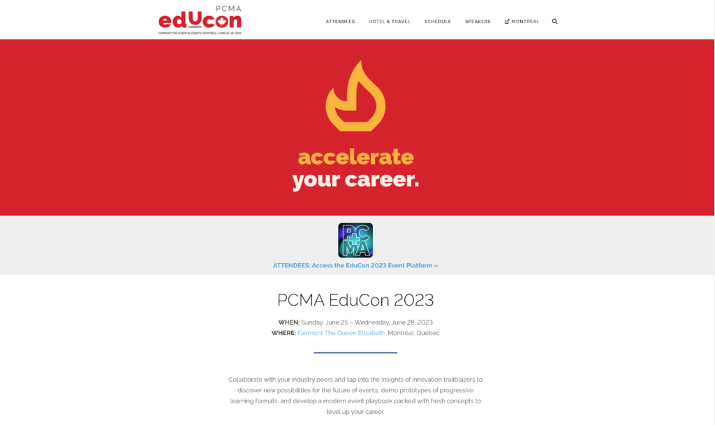
What we like about this conference event website:
- The crisp, high-contrast design
- Effective navigation with clear CTAs
- Interactive agenda section
Takeaway: The power of effective visual communication and a well-structured event agenda.
Collision
Collision is one of the world’s biggest tech conferences, attracting attendees from across the globe.
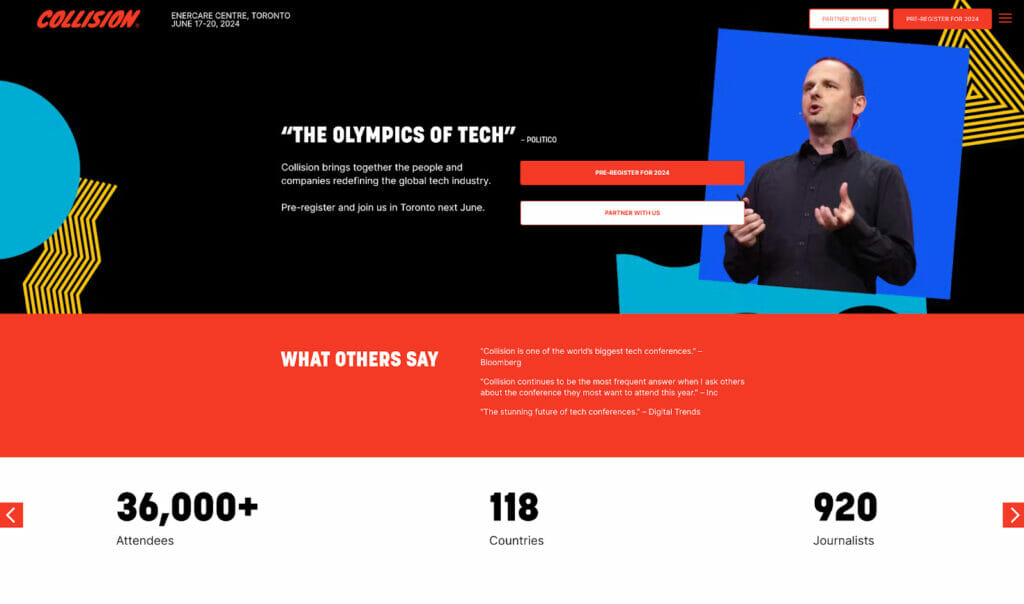
What we like:
- Strong branding and bold color choices throughout
- Engaging multimedia content
- Live countdown adds a sense of urgency
Takeaway: The role of solid branding and engaging multimedia in not only capturing visitors’ attention–but also keeping them clicking around your site.
Experiential Marketing Summit
Experiential Marketing Summit is the world’s largest conference on experiential marketing.
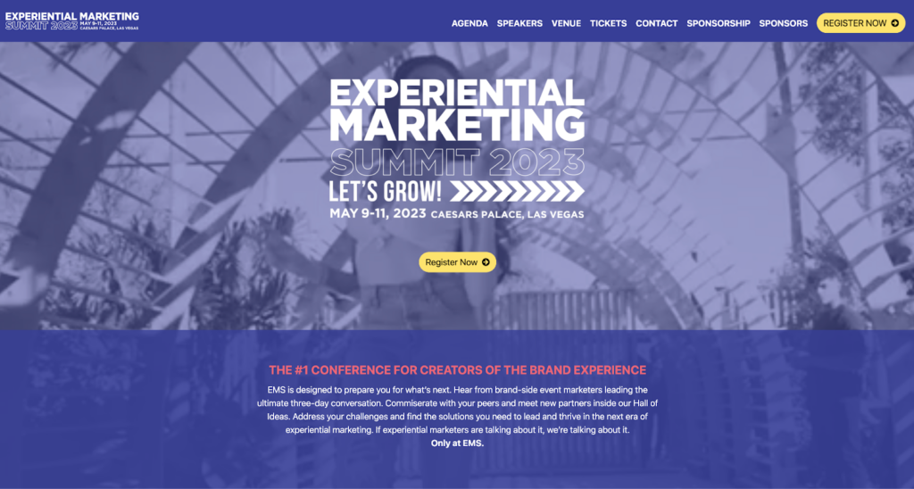
What we like:
- Bold and vibrant design
- Clear overview of the event
- Engaging animations
Takeaway: The effectiveness of bold designs and animations in driving user engagement.
Inbound
Inbound is a conference hosted by HubSpot that brings together marketing, sales, and service professionals.
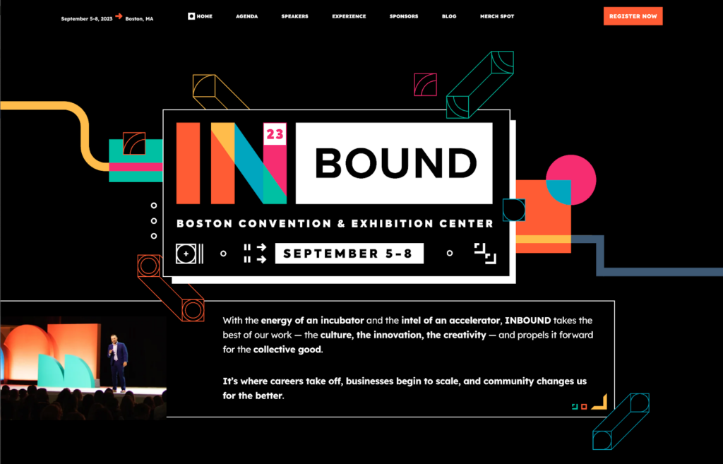
What we like about this conference website:
- Clean and minimalist design
- Well-structured schedule
- Integrated social proof
Takeaway: Never underestimate the power of a minimalist design complemented by well-structured information.
IMEX Frankfurt
IMEX Frankfurt is a worldwide exhibition for incentive travel, meetings, and events.
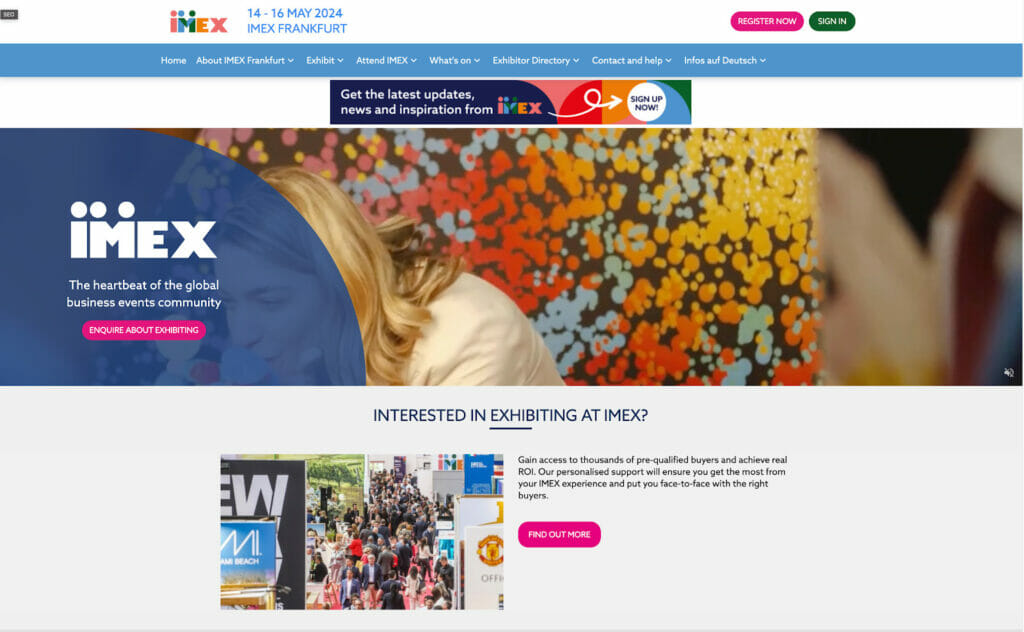
What we like:
- Intuitive navigation system
- Comprehensive information on speakers and exhibitors
- Multilingual support
Takeaway: The importance of a comprehensive website that caters to an international audience.
MPI WEC
MPI WEC is a platform where meeting and event professionals learn and connect.
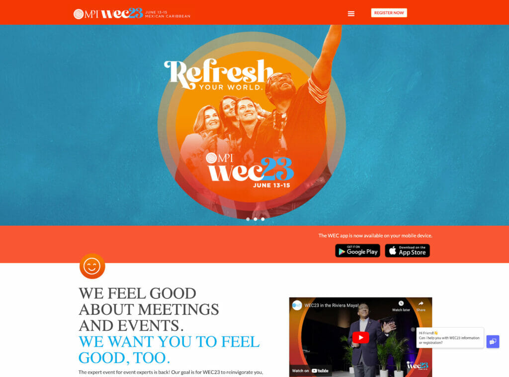
What we like:
- Eye-catching visual elements
- Detailed overview of the event
- Prominent registration CTA
Takeaway: Impact of visual storytelling in event promotion and easy registration process.
B2B Marketing Exchange
B2B Marketing Exchange is a hub for the latest tactics in B2B marketing.
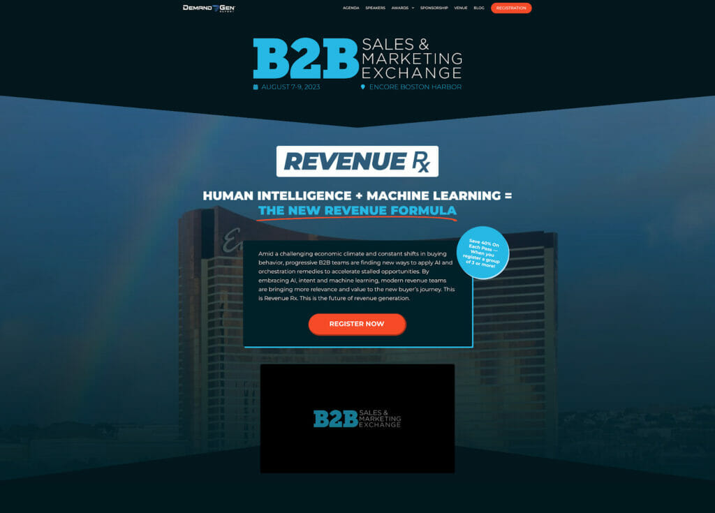
What we like:
- Effective use of video content
- Easy access to session recordings
- Integration of social media
Takeaway: The power of integrating multimedia and social media for effective event marketing.
Dublin Tech Summit
Dublin Tech Summit brings together global leaders in innovation, technology, and business.
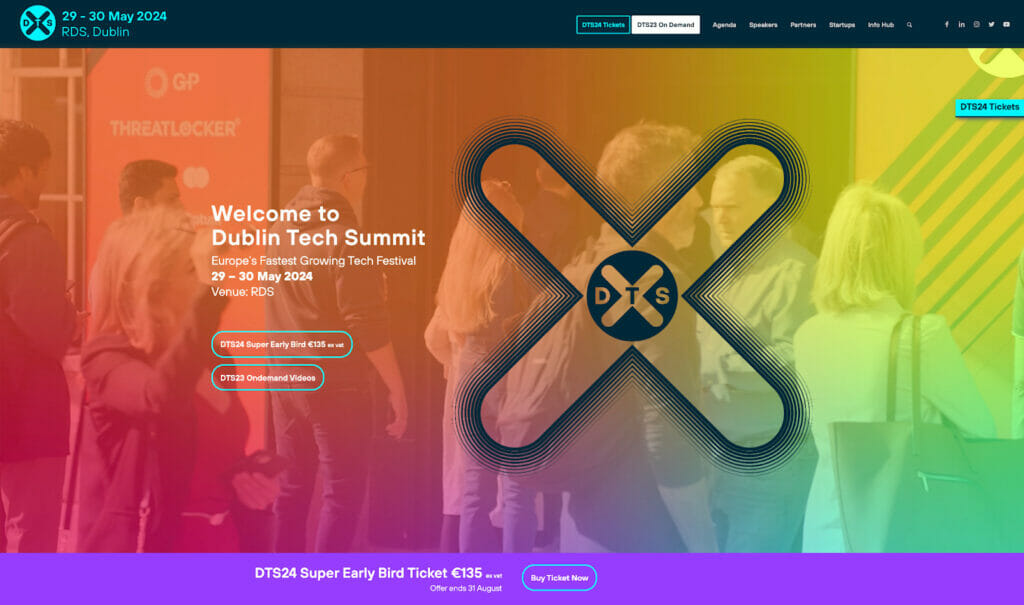
What we like:
- Dynamic, responsive design
- Showcase of speakers and partners
- Easy-to-navigate schedule
Takeaway: Balancing aesthetics and functionality for an effective user experience.
CES Digital Health
CES Digital Health is a platform that showcases innovations in healthcare technology.
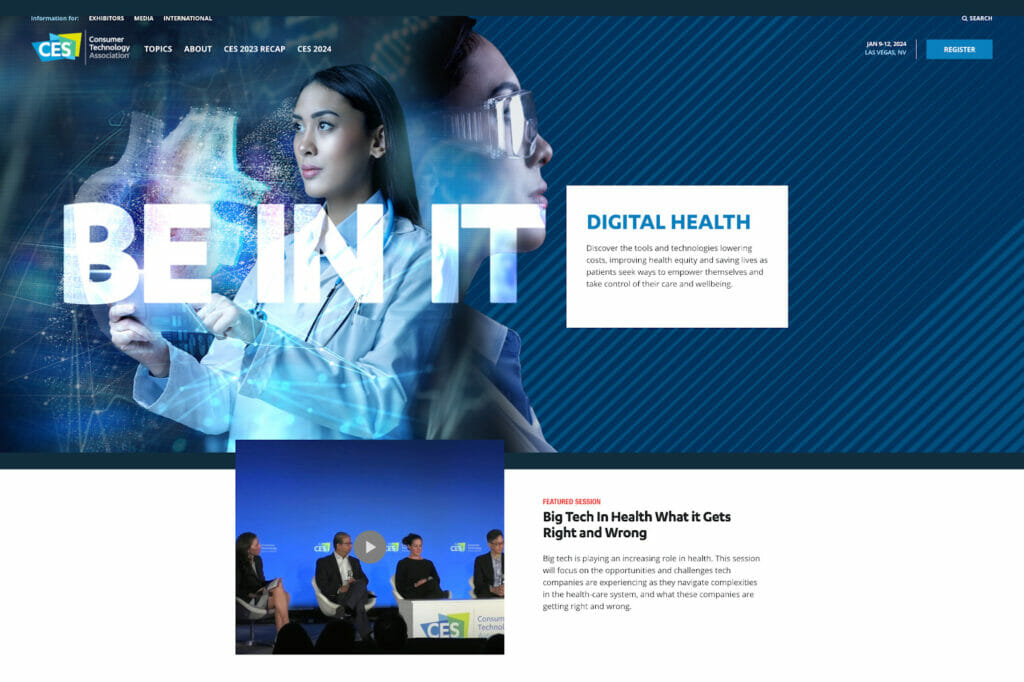
What we like:
- Emphasis on media and press, making the latest news accessible
- Innovative use of graphics
- Neatly divided into thematic sections
Takeaway: Importance of thematic organization for easy navigation and integrating a press section for media engagement.
HIMSS Global Health Conference
The HIMSS Global Health Conference is a can’t-miss health information and technology event.
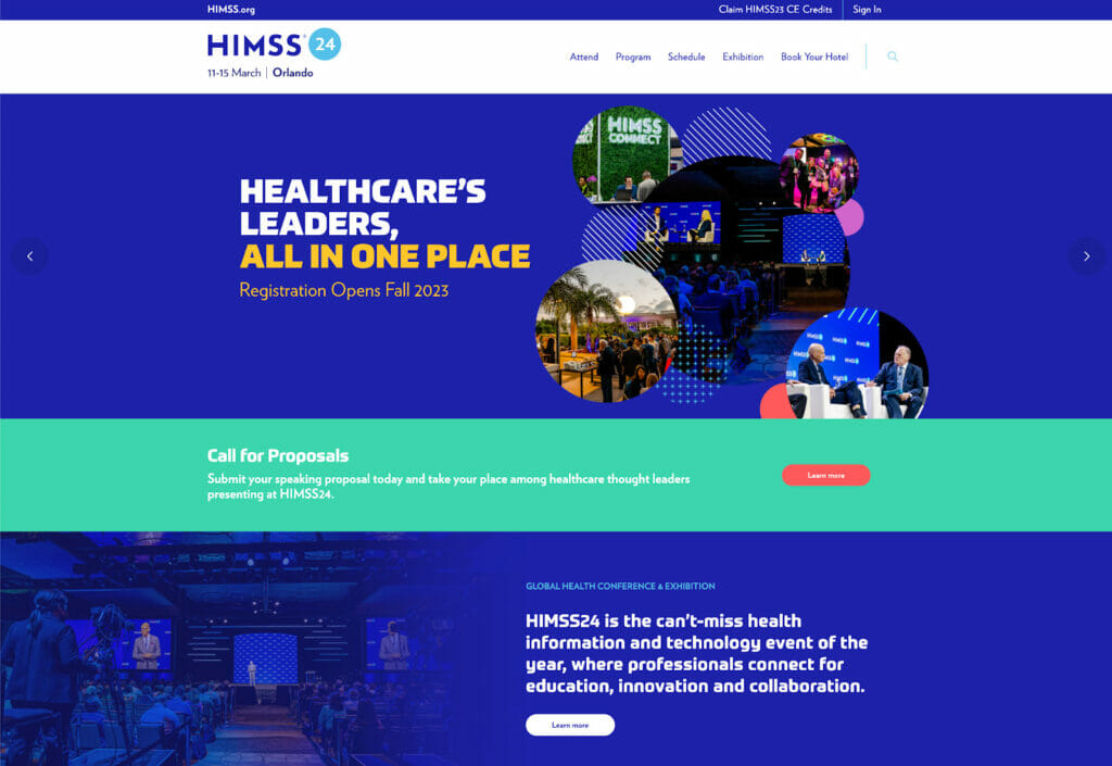
What we like:
- Clean, professional design
- Easy-to-access key information
- Interactive elements for an engaging experience
Takeaway: A clean and intuitive interface can provide a seamless user experience.
FinCon
FinCon is where money and media meet—a conference for personal finance influencers and their fans.
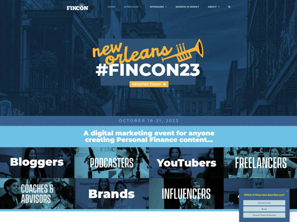
What we like:
- Engaging video content
- Information segmented by attendee type
- Extensive use of testimonials for social proof
Takeaway: The power of segmenting information for different user groups and incorporating social proof.
MoneyConf at Web Summit
MoneyConf is a fintech conference at Web Summit, one of the largest tech events in the world.
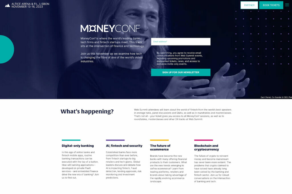
What we like:
- Clean, modern aesthetic
- Detailed speaker bios
- High-impact imagery
Takeaway: The impact of a clean, modern design and detailed speaker information.
Collaborative
Collaborative is a conference bringing together nonprofit professionals to share, learn, and be inspired.
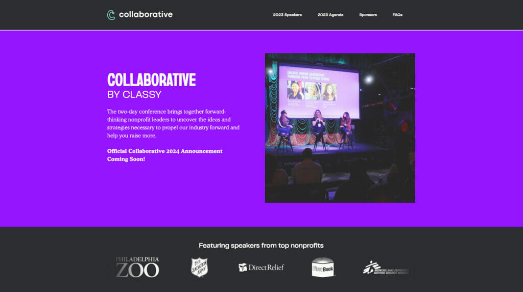
What we like:
- Use of high-quality images
- Impressive speaker lineup
- Social proof through past attendee testimonials
Takeaway: Quality visuals, prominent display of speakers, and social proof enhance credibility and attract visitors to this nonprofit event website.
The Fold
The Fold is a literature festival showcasing diverse Canadian authors and books.
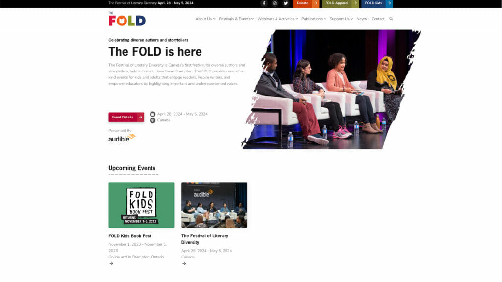
What we like:
- Captivating design with a unique, artsy aesthetic
- Comprehensive event information
- Integration of social media feeds
Takeaway: Unique aesthetic design and social media integration can create a vibrant, engaging website experience.
Frankfurt Book Fair
The Frankfurt Book Fair is the world’s largest trade fair for books, attracting exhibitors from across the globe.
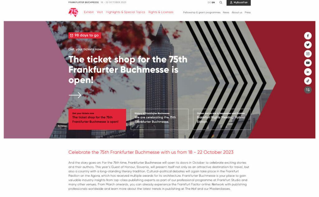
What we like about this event website:
- Clear navigation and organization of information
- Multilingual website catering to a global audience
- Eye-catching design elements and consistent visual branding across every page
Takeaway: For international events or organizations catering to a global audience, a multilingual website is key to improving the user experience and accessibility.
Analyzing the event website examples listed above (or any that catch your eye in the wild!) is a great way to gain insights into best practices and discover innovative ideas to incorporate into your own event website.
When in doubt, remember that a successful event website balances aesthetics, functionality, and user experience to effectively convey information and drive conversions.
Looking for even more inspiration for your site? Check out these 17 association website examples!
How to Create an Event Page: The Attendee Experience
Designing an event page is about crafting an immersive, engaging, and smooth experience for your attendees.
This is where an event content management system (CMS) like EventMobi’s Experience Manager comes into play. The Experience Manager is designed to make creating and managing an event site a breeze, so you can provide an engaging–and organized–attendee experience.
Curious about how Experience Manager can help you create better event experiences? Here are some of the ways you can use this powerful CMS to elevate the attendee experience:
Personalize Your Event Page
You have the freedom to tailor your event page to reflect your brand and event theme. Whether you want to change the colors, add sponsor logos, or adjust the layout, Experience Manager makes it easy to create a unique look and feel that resonates with your attendees.
Streamline Navigation
Prevent attendees from getting lost in a sea of information by organizing your content with custom menus and folders. From the event agenda to speaker bios to video libraries, make it simple for your attendees to find what they need in just a few clicks.
Engage Your Attendees
Integrate interactive features such as Live Polls and Surveys directly into your event page. These elements keep your attendees engaged and provide opportunities for valuable feedback and interaction.
Update in Real-Time
Running an event can mean dealing with last-minute changes. With Experience Manager, you can make updates on the fly to ensure your attendees always have the most current information at their fingertips.
Deliver Content Efficiently
Whether you need to distribute presentations, PDFs, or other resources, Experience Manager makes it easy to upload and organize your content in one place–allowing you to curate an accessible one-stop resource hub for your attendees.
Optimize for All Devices
EventMobi ensures your event page looks great and functions smoothly across all devices. Whether your attendees are using a laptop, tablet, or smartphone, their experience will be consistent and user-friendly.
The Best Event Websites Deliver an Experience
Remember, the goal is to build an event management website that not only informs but also engages your attendees by providing them with an immersive and seamless experience.
With tools like EventMobi’s Experience Manager, you’re not just building a website, you’re creating an engaging attendee journey from the very first interaction.
Interested in seeing EventMobi in action? Book your personalized demo of EventMobi’s Event Management Software platform today! 🎉